What is a Candlestick chart?
A candlestick chart is a graphical representation of the price movements of an asset for a specific time period.
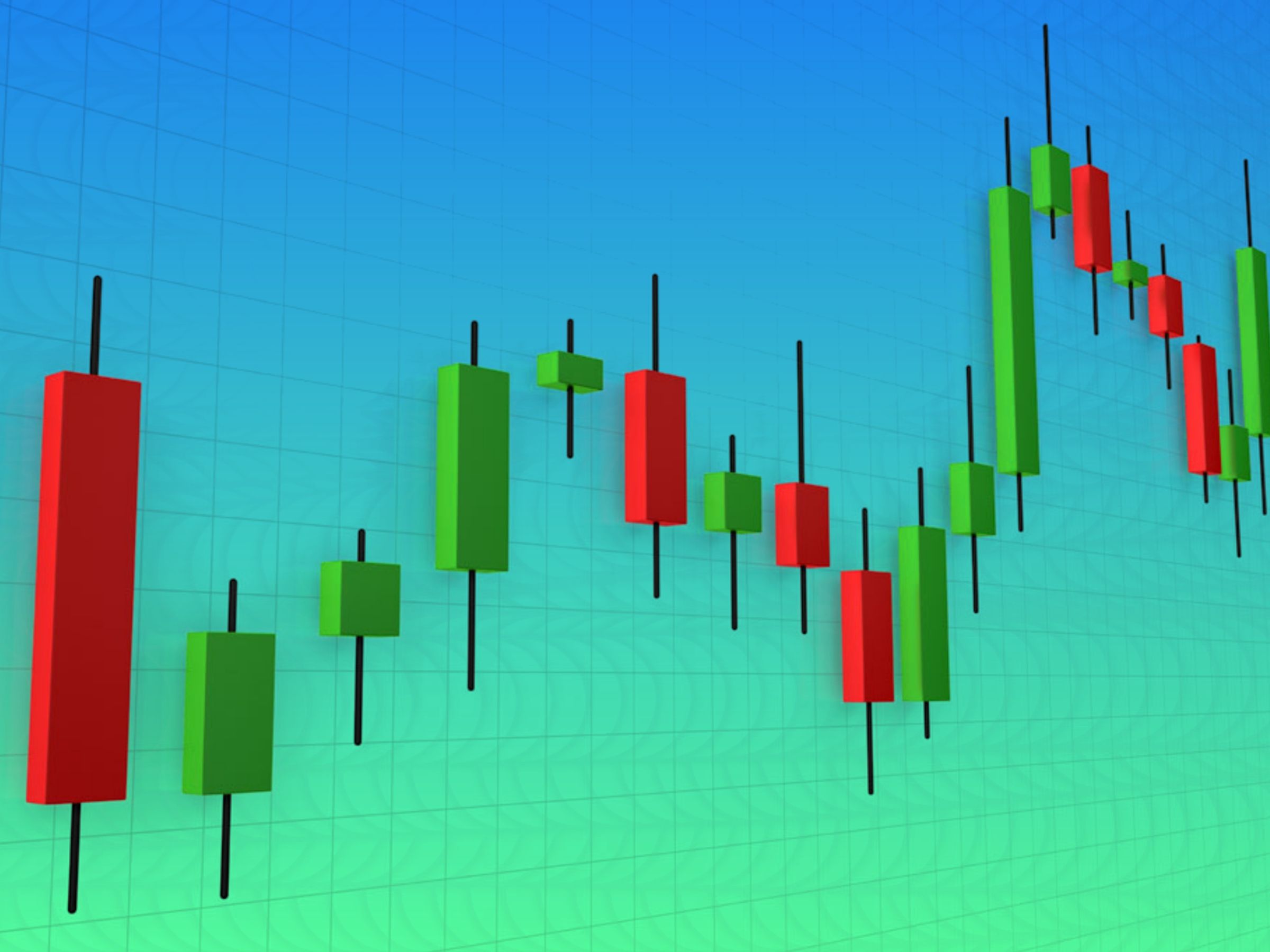
The chart is made up of candlesticks, as its name implies.
Each candlestick represents the same amount of time.
The candlesticks can represent virtually any period, from seconds to years.
Candlestick charts have been around since the 17th century.
It is often claimed that a Japanese rice trader named Homma invented this charting tool.
It was likely his ideas that gave rise to the modern candlestick chart.
Homma’s idea has been through several modifications.
One of such modifications was by Charles Dow, one of the pioneers of modern technical analysis.
Although candlestick charts find application in the analysis of any type of data, you can use them to analyze financial markets.
By using them correctly, traders can measure the probability of a price movement and its outcome in a market.
Traders and investors may find them useful as they can derive their own conclusions from market analysis.
How do candlestick charts work?
Each candlestick is made up of the following price points:
- Open — The asset’s first recorded trading price within the given timeframe.
- High — The asset’s highest trading price recorded during that timeframe.
- Low — The asset’s lowest trading price during the specified period of time.
- Close — The asset’s last trading price recorded in a particular time period.
As a whole, these values are commonly known as OHLC values.

How a candlestick looks depends on the relationship between the open, high, low, and close.
Body refers to the distance between the open and close, while wick or shadow pertains to the distance between the body and high/low.
A candlestick’s range is the distance between its high and its low.
How to read candlestick charts
Even though candlestick charts provide similar information to bar and line charts.
Many traders consider them easier to read than bar and line charts.
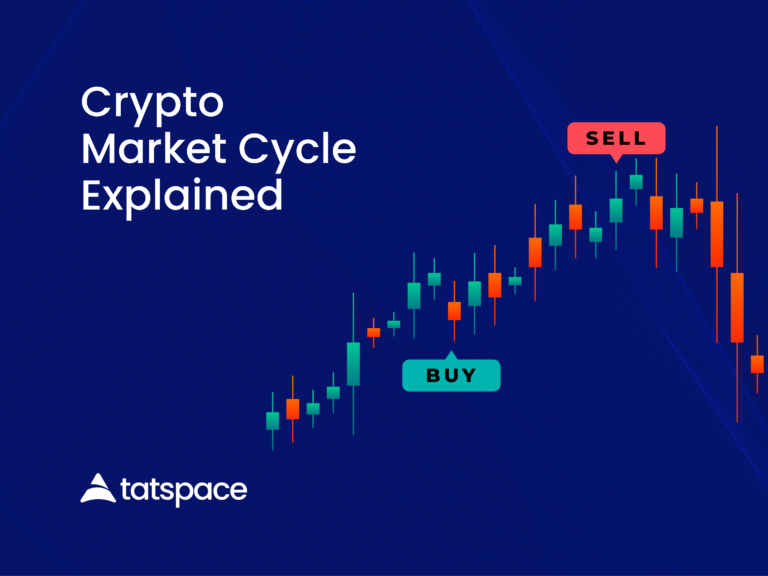
A candlestick chart provides a quick representation of price action and can be read at a glance.
In practice, candlestick charts show the bulls and bears of a market over a specific period.
Typically, the longer the body, the greater the intensity of buying or selling pressure during the measured timeframe.
Short wicks on a candle show that a high (or a low) at the specific timeframe was near the closing price.
Depending on the charting tool, the colour and settings may vary.
But if the body is green, that usually means that the asset’s close was higher than its open.
Red indicates a price fall during the period, meaning the close was lower than the open.
There are chartists who prefer black-and-white representations.
As a result, instead of using green and red, empty candles indicate up and black candles indicate down movements.
Do candlestick charts tell you everything?
You can use candlesticks to get an idea of the direction of price action, but they are not always enough to provide an in-depth analysis.
When you look at candlesticks, for instance, you can’t see everything that happened during the interval between the open and close, only the distance between the points (as well as the highest and lowest price).
Although the candlestick wicks can tell us the highs and lows of a period, they cannot tell us which one occurred first.
Nonetheless, most charting tools allow the user to change the timeframe, which allows for greater detail in lower timeframes.
The candlestick chart can also contain a lot of market noise, especially if it is displaying data in low timeframes.
However, they change very quickly, which can make their interpretation difficult.
Heikin-Ashi candlesticks
Until now, we have examined what is sometimes called a Japanese candlestick chart.
Nevertheless, there are other methods of calculating candlesticks.
One of those methods is the Heikin-Ashi Method.
Heikin-Ashi is a Japanese term for “average bar”.
The candlestick charts of this type use a modified formula that is derived from average price data.
Smoothening price actions and removing noise from the market are the main goals.
In this way, Heikin-Ashi candles can be helpful to identify market trends, price patterns, and potential reversals.
In addition to Japanese candlesticks, many traders use Heikin-Ashi candles to reduce the chances of false signals and improve the odds of spotting market trends.
A green Heikin-Ashi candle with no lower wick typically indicates an uptrend, and a red candle with no upper wick generally indicates a downtrend.
Heikin-Ashi candles are powerful tools, but they also have their limitations, just like any other technique in technical analysis.
Generally, these candles may take longer to develop patterns because they use averaged price data.
Furthermore, their lack of price gaps can obscure other price information.
Wrapping it up
Investors and traders both rely on candlestick charts to make their decisions.
Moreover, they allow the user to analyze data in different timeframes while presenting a visual representation of the price action for a given asset.
Combined with an analytical mindset and enough practice, a thorough study of candlestick charts and patterns may give you an edge over the market.